Top 5 Paintings - London’s National Gallery

My biggest mistake in visiting London’s National Gallery was that I lived in London for 7 months before I stepped foot in the door. What time wasted! I visited for the first time in May and returned again at the end of July, for the final days of the Raphael exhibition.
This museum is a treasure trove of art, the building is beautiful with a rich history and an absolute must see for anyone interested in art who visits London.
A Short History:
What was original a collection of 38 pieces purchased and housed at 100 Paul Mall in 1824 is now a collection of over 2600 paintings in the prominent building sat on the North side of Trafalgar Square. In the nearly 200 year history, the collection and the building have evolved and transformed, ranking as one of the top 10 art museums in the world.
From the beginning, The National Gallery has committed to accessibility and education. The gallery was established as a “gallery for all” having free entry to view the collection, lectures, tours, seminars and extended hours, allowing those form all walks of life to benefit from the experience of wandering the expansive halls.
Experiencing the Museum
Aside from the paid exhibits, the museum is broken down into three art routes. You’ll see the estimated times to visit per each section outlined in the gallery map below.

These times feel like an approximation from Google Maps based on the distance to travel each group of galleries by foot!
If you are anything like me, read:
Needs to review each feather of each angel’s wing
Must take a photo of each dog which appears in a painting
Requires moments of silence in front of paintings by your favourite artists
…then I would plan to spend 2-3x the recommend time in almost all of these art routes.
There is no charge to view the collection, though if you want to see one of the featured exhibits (not included in the route time estimates), you’ll need to buy a ticket with a timed entrance.
Planning Your Visit
If you’re short on time and really just want to say you’ve seen it all, I would budget 2 hours for the works and the gift shops.
If you have the time to relax and enjoy, I would plan of 4-5 hours, including one of the paid exhibits, a lunch in the cafe and time to look through each gift shop. The gift shop near the exit is much larger if you’d prefer just to visit one of them.
Evaluating Art
Art is subjective.
This subjectivity goes beyond personal preference, but even within the individual depends on the time, the place, the temperament, the level of exposure to specific pieces or styles of art.
Art is personal. Art is emotional.
My favourite pieces move me past mental stimulation producing a full physical response.
I don’t prefer a Jackson Pollock, but I do fine extreme beauty and tranquility in a Mark Rothko- both are revered abstract painters whose works have sold for tens of millions of dollars.
Leonardo Da Vinci and Michelangelo Buonarroti are two of the most prominent artist of not only the Italian Renaissance, but of all time. I appreciate their work and their talent, but head to head, I would choose a Sandro Botticelli (likely) every time.
The statue of David is a wonder, but it doesn’t evoke the same emotional response as Primavera does.
Understanding Preferences
This Top 5 list are my personal Top 5, representative of my own tastes and preferences.
Do you know what draws you to certain pieces of art? It could be a specific medium such as painting or sculpture. You may even be able to parse out WHY this medium or a specific style of painter is your favourite, or you may just have a mental or gut feeling of what you like.
I used to stand firmly in the “Italian Renaissance” camp, but needed to direct WHY that style was most attractive for me.
My taste, and this list may evolve over time, but I’ve started to outline the elements of a painting that draw me in. Using this “list of likes” I narrowed down the long list of impressive paintings in the National Gallery down to 5.
Note: there is no reason to limit myself to 5 favourites other than hours a day to write this up.
My “List of Likes”:
Fabric Folds: the flow of the clothing, has always, been what first catches my eye, IYKYK (@Katieinfield this is for you!)
Crisp delineation: not impressionism but not cubism
Bold Colours: fairly self evident, I like a good pop of colour
Intricacies: whether in clothing, armour, architecture or other, little details bring the paintings to life
My Top 5 Works at the National Gallery

St Michael Triumphs over the Devil, 1468
Bartolomé Bermejo (Spanish)
What a feeling to discover a painting that you’ve never seen or heard of in person for the first time and be so mesmerised. I was taken aback when I first saw Michael standing over this animated devil in May during my first visit to the National Gallery. This painting is “widely considered the most important early Spanish painting in Britain” per the National Gallery site.
Fabric:
Fabric aplenty and certainly lots of folds here which we love, but the fabric has a somewhat papier-mâché quality, so we’ll give it 4 out of 5 superlative stars
Bold Colours:
The amount of gold plays the part of a neutral since it takes over so much of the frame versus being used as a highlight, but this provides a stark contrast to the deep crimson of the cape and wings, the eyes and tongue of the devil, the dark silver of the chainmail provide a bit of a metallic balance to the flood of gold
Intricacies:
Bejewelled armour with what feels, like a green satin accent, the details on the shoes, the illumination (colourful drawing) in the book of Psalms held by Antoni Joan, Lord of Tous. All magnificent!
Do you see a city reflected in the armour covering his stomach?
Take a look at the detail in the close up shots below.


The Virgin and Child, 1480-90
Domenico Ghirlandaio (Italian)
There are hundreds if not thousands of depictions of this scene, the Virgin Mary and with her immaculately conceived child. Similar to this Ghirlandaio rendition, the pair will appear in front of a landscape either in the outdoor settings itself or in front of a window which frames the countryside behind. I like this version as she is placed prominently in the centre, fully in view. Often time the child Jesus is pictured held in her arms or in front of her, but here he appears to her right side standing with little support.
Fabric:
Beautiful dress and cloak a natural flow of fabric and thin transparent veil
Crisp delineation:
Clarity between characters, foreground and backgrounds.
Bold Colours:
Here she is depicted in a lovely dark rose with an emerald colour cloak against a muted background. The window frame within the painting itself is s simple grey, the gold below is the frame itself in the gallery. The clock itself would have previously appeared more of a blue tone, but the pigment, azurite, has changed over time.
Intricacies:
We see some fine detail in the veil and at the edge of the dress and cloak, but considerably less than what we saw with St. Michael. Can’t fault a young mother for not having a full suit of guided armour though.
Influential Provenance: After the death of his mother, 13 year old Michelangelo began working with Ghirlandaio. Denis Byrd’s The Renaissance Podcast’s Ghirlandaio Episode is a great resource to learn more about this influential artist.
Observe the detail of her garments below. I am continually amazed how the change in value of a painting creates depth. What a wonderful illusion.

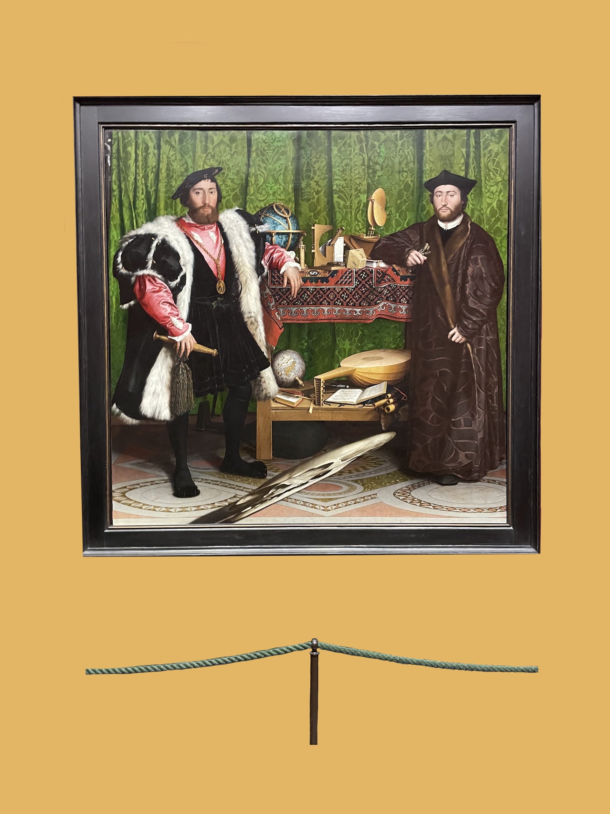
The Ambassadors, 1533
Hans Holbein the Younger (German)
Take a few moments to take in all of the elements of this painting. What stands out to you the most? What is unexpected?
I love this painting of “The Ambassadors”; Jean De Dinteville, aged 29 on the left was the French Ambassador to the court of Henry VIII and 25 year old Georges De Selve, the Bishop of Lavaur on a visit to London in 1533.
Imagine a life where this was typical dress for men whose interests were diplomacy and astronomy. What might this painting look like if painted in 2022? Maybe I will paint a reprisal with my two brothers!
Bold colours, an abundance of fabrics, intricate details in an assortment of items on the shelves and that is all before our eyes start to process the distorted skull that appears on the floor!
Did you notice the skull? It’s rather striking once you notice it, but it was actually one of the last details that registered for me. Take a look at the pictures below to see how the skull appears based on the angle which you view the painting!
Fabric:
With a quick squint and measure, I would say that 60% or more of this painting offers maximal fabric folds! Dramatic drapery covering the back wall, a carpet which covers the top shelf, multiple layers on Jean himself including fur accents, and a full length patterned coat for Georges. Not only do we have a ton of canvas coverage of this fabric, but much of the fabric itself is patterned, adding additional texture.
Bold Colours:
Again squinting (squinting is not actually required to appreciate this piece) there is some some clear colour blocking with two dark columns appearing in front of a solid green background. The fabric field of green is contrasted through a variety of reds through the patterned red carpet, the garment worn by Jean and even the light peach tiles of the floor.
Intricacies:
I love the detail of the two globes, the assortment of books and objects on the two shelves where the men rest their arms. I also love the detail of the rose and gold patterns in the floor tile. It’s hard to perceive in the full photo but there is detail on Jean’s dagger and on the book under Georges’ arm which indicate their respective ages at the time of the painting. You can see the 29 in on the dagger handle in the picture below.
Though I usually think of intricacies in terms of small details but in this case, there is a large “detail” which must be addressed - the skull. It is included as a symbol of mortality, but why included a skull and why in this elongated share? Could we understand the understanding of mortality is distorted by youth?
When viewed from the right hand side of the canvas, you’ll see the skull appear with mortal proportions but from the front and left, the extreme distortion.


Canon Bernardijn Salviati and Three Saints, 1501
Gerard David (Dutch)
I’ve an odd affinity for Catholic art despite not being Catholic. The Catholic church were the patrons of much of the art produced for many centuries, and for that I am grateful as many others (outside of ruling families and others who possessed great wealth) did not have means to commission such extravagant pieces.
Fabric:
What an excellent display of fabric within this painting. We have a variety of fabric colour, texture and decoration on Saint Martin of Tours in the red and St. Donatian in the blue adorned cloak on the right.
Bold Colours:
A pleasing balance of blues and greens in the background with strong pop of red and blue in the cloaks of the Saints.
Intricacies:
Of the five pieces I’ve included here, I think this may take P1 when it comes to intricacies. Take a look at the gold trim on the red cloak which features 6 saints and the detail of the adornment on the mitre, as well as the detailed architecture included on the staff just above his hands.
On Saint Donatian (right), we see again, intricate architecture on the staff, detailing perhaps other saints, and on the clasp of his cloak we see three additional characters which look to be perhaps two angels and possibly Mary and Jesus, which if the child is present, would make a 4th form within this small section. Beyond we have the detail of the fabric in both the blue underside and black and gold pattern on the exterior.
Wow. Wow! and then a final OwenWilson “WoOw”.


Venus and Mars, 1485
Sandro Botticelli (Italian)
Perhaps my biases for Botticelli are showing here, but I had to include Venus and Mars in my selection of the top five works from the National Gallery. Botticelli was known for painting secular works depicting pagan stories based on Roman Mythology as well as works with religious subjects.
Twelve works at the National Gallery are non-secular, and portray images of the virgin and child, congregations of saints and a nativity scene, two are portraits of each a man and lady and the last, a scene of Venus and Mars, Roman Goddess of Love and God of War.
My absolute favourite Botticelli pieces hang in connecting rooms within the Uffizi Gallery in Florence, Italy, but Venus and Mars was the first painting of Botticelli’s I have experienced first hand. It was incredible to stand mere inches away, observing the brush strokes, knowing that roughly 550 years ago, 1000 miles away, Sandro himself would have stood at the same distance away from the same painting.
It’s a strange parallel to seeing your favourite musical artist perform live or your favourite athlete in competition. It’s the closest that you can get when your idols and inspirations are 500 years expired.
Fabric:
Of the selection, Venus and Mars, has the least intricate fabrics, but I do have an affinity for this dress that Venus pictured here with Mars as it is quite similar to the one which she wears in Botticelli’s Primavera, which is to date, my favourite painting.
Bold Colours:
The colours here are also not as bold as some of the works mentioned previously, but I appreciate the divided of blue and green in the distance background and the balance of silvery whites, browns and flesh collars in the foreground. There is a decent amount of skin exposed from Mars and the satyrs, and tree limbs exposed, it all feels very natural. Natural with an element of supernatural :).
Intricacies:
We find details in the hair of all characters and in the armour the satyr’s have coopted while Mars sleeps. Nothing extravagant, but still, beauty in their simplicity.


